
How do we efficiently teach R?
How to efficiently teach R has recently become a burning question, as the use of R for statistical computing is growing rapidly. Beyond the nature of an open-source platform, the magnitude of packages available for specific data analyses is massive. Also the extensive online support at e.g. Stack-overflow and the possibilities for creating own packages drive researchers to R.
The need for efficent data analysis and tools in R is there, but how do we teach R to students, who have no or very limmited experience with coding and statistics in general?
Locally at Aarhus University there is no formal courses, lectures or workshops to fascilitate the use of R for students outside Mathematics or Statistics Deparments. For a while I have been interested in sharing some of the basic concepts using R for data science with my fellow research colleges. I decided to go for it, prepare a basic workshop in R, although I do not have any previous experience in teaching statistics. The course was prepared in collaboration with my fellow college, PhD-candidate Emil Tveden Bjerglund. The workshop was designed as a interdisciplinary course with attendents from the faculty of Health, Clinical Medicine, and faculty of Science and Technology, Nanoscience.
The workshop outline covered:
- ”The R-Safari” - basic computations in R
- Simple mutations of a dataset using Dplyr
- ”Show me data” – plotting with ggplot2
- Load and ”wrangle” of datasets - play with your own data.
The learnr package
To activate the students we found it usefull to build a small learning environment, which was loaded through the learnr package: rbeginner. Although some students struggled installing or updating R and loading the dependencies.
Conclusion: Learnr tutorials is very useful! Avoid local installing for first-time user of R. The setup of R can be extremely difficult for the first-time user.
1. “The R safari”
It felt reasonable starting out by stating that R is basically an advanced calculator, and how vectors and assigning works. This familiarizing step was accomplished through the hands-on learning environment.
following the short introduction we headed directly for functions in tidyverse ecosystem.
2. Simple mutations and dplyr
Often we have some data, where for each observation we have recorded several values of interest. The most straight-forward way to store such data is in a data-frame (or a tibble as it is also called). The data can be stored in a tidy format as illustrated below for the easiest access and manipulation.
There are three interrelated rules which make a dataset tidy:
- Each variable must have its own column.
- Each observation must have its own row.
- Each value must have its own cell.
Dataframes in R can be constructed using the tibble() function. It is part of the tidyverse package, so we need to load that first.
library(tidyverse)

df <- tibble(name = c("Emil", "Anders"),
             age = c(27, 27),
             height = c(170, 185),
             postcode = c(8000, 8000),
             edu = c("Nanoscience", "Medicine"))
df
## # A tibble: 2 x 5
##     name   age height postcode         edu
##    <chr> <dbl>  <dbl>    <dbl>       <chr>
## 1   Emil    27    170     8000 Nanoscience
## 2 Anders    27    185     8000    Medicine
As you can see, we can easily organise our data in a tibble. From the output you can see the data-type of each column. We can access columns ($) or single values ([]), apply functions etc:
df$name
## [1] "Emil" "Anders"
df$edu[1]
## [1] "Nanoscience"
sum(df$age)
## [1] 54
A small dataframe like this is easy to handle, but often you will have many variables and observations. R has various functions for easily getting an overview of a dataframe.
A built-in example of a large dataset is called diamonds, and contains information about the price and quality of 53940 diamonds. Try using the functions head(), summary(), str() and glimpse() to gain information about the dataset.
diamonds
## # A tibble: 53,940 x 10
##    carat       cut color clarity depth table price     x     y     z
##    <dbl>     <ord> <ord>   <ord> <dbl> <dbl> <int> <dbl> <dbl> <dbl>
##  1  0.23     Ideal     E     SI2  61.5    55   326  3.95  3.98  2.43
##  2  0.21   Premium     E     SI1  59.8    61   326  3.89  3.84  2.31
##  3  0.23      Good     E     VS1  56.9    65   327  4.05  4.07  2.31
##  4  0.29   Premium     I     VS2  62.4    58   334  4.20  4.23  2.63
##  5  0.31      Good     J     SI2  63.3    58   335  4.34  4.35  2.75
##  6  0.24 Very Good     J    VVS2  62.8    57   336  3.94  3.96  2.48
##  7  0.24 Very Good     I    VVS1  62.3    57   336  3.95  3.98  2.47
##  8  0.26 Very Good     H     SI1  61.9    55   337  4.07  4.11  2.53
##  9  0.22      Fair     E     VS2  65.1    61   337  3.87  3.78  2.49
## 10  0.23 Very Good     H     VS1  59.4    61   338  4.00  4.05  2.39
## # ... with 53,930 more rows
3. ”Show me data” – plotting with ggplot
The packages ggplot2 is a part of the so called tidyverse package-environment. Using this Grammar of Graphics can be a little more time consuming in the beginning, when learning the syntax - however the reward is considerable, as you will be able to effectively edit a plot and make it reproduceable.
A basic example using the build-in dataset iris which contains information on different species of the iris-flower.
Firstly, assign a new emty ggplot to an element (e.g. called p1), and modify the plot. This is a basic example - try to explore different geom’s, however note that the may depend on setting the aes() corretly, as a histogram only takes one variable (no y-axis) etc.
library(tidyverse) #Be sure, that the tidyverse environment is loaded
p1 <- ggplot() #Create a new element and assign a ggplot

p1 <- iris %>%
        ggplot( aes( x = Sepal.Width)) + #Use Aesthetics = aes() inside a ggplot to define axis values, x = var.
        geom_histogram() +               #Use Geometrics = geom_xx() and add (+) it as a layer on the plot.
        facet_wrap(~Species)            #USe facets to plot in subgroups.

p1 #View your work by calling the element name, in this example 'p1'.
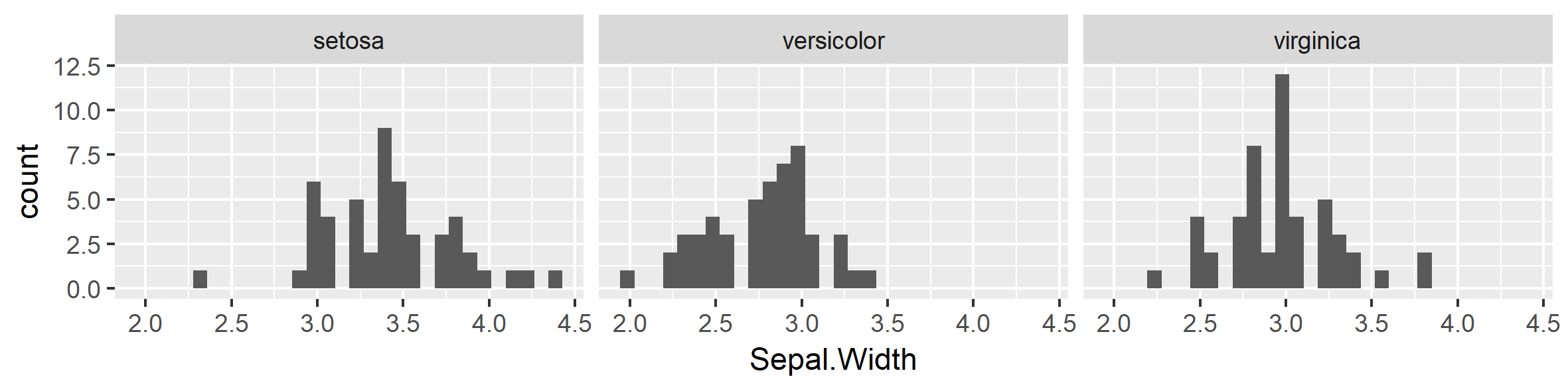
## `stat_bin()` using `bins = 30`. Pick better value with `binwidth`.
Below, another example using the build-in dataset mtcars. Explore the variables yourself by writing ?mtcars in the console.
p2 <- mtcars %>%
        ggplot( aes(x = hp, y = mpg, color = as.factor(cyl))) +
        geom_point()  +
        stat_smooth() +
        theme_bw()

p2
## `geom_smooth()` using method = 'loess'
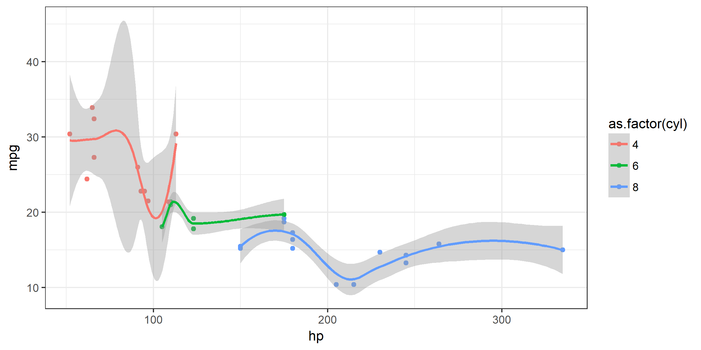
Note how the plot developed through: Data -> aes() -> geom() -> stat_() -> theme_() …
Simple mutations of data using dplyr
R has some built-in functions for working with dataframes. As is often the case, however, a package has been made that makes this even easier. In this tutorial, we will use dplyr from the tidyverse.
For this, we will use the built-in dataset call iris, which contain measurements lengths and widths for 50 flowers.
head(iris, 3)
##   Sepal.Length Sepal.Width Petal.Length Petal.Width Species
## 1          5.1         3.5          1.4         0.2  setosa
## 2          4.9         3.0          1.4         0.2  setosa
## 3          4.7         3.2          1.3         0.2  setosa
dplyr has 5 basic functions which cover most data challenges:
- Pick observations by their values (
filter()). - Reorder the rows (
arrange()). - Pick variables by their names (
select()). - Create new variables with functions of existing variables (
mutate()). - Collapse many values down to a single summary (
summarise()).
For example, two new variables can be created based on the exsisting variables by using mutate():
iris %>%
  mutate(product = Sepal.Length * Sepal.Width,
         diff = Sepal.Length - Petal.Length)
Create summary statistics by group using group_by:
iris %>%
  group_by(Species) %>%
  summarise(mean = mean(Sepal.Length), sd = sd(Sepal.Length))
## # A tibble: 3 x 3
##      Species  mean        sd
##       <fctr> <dbl>     <dbl>
## 1     setosa 5.006 0.3524897
## 2 versicolor 5.936 0.5161711
## 3  virginica 6.588 0.6358796
Or filter out those flowers with a Sepal length larger than 6.5 and a Petal length larger than 6.0:
iris %>%
  filter(Sepal.Length > 6.5, Petal.Length > 6.0)
##   Sepal.Length Sepal.Width Petal.Length Petal.Width   Species
## 1          7.6         3.0          6.6         2.1 virginica
## 2          7.3         2.9          6.3         1.8 virginica
## 3          7.2         3.6          6.1         2.5 virginica
## 4          7.7         3.8          6.7         2.2 virginica
## 5          7.7         2.6          6.9         2.3 virginica
## 6          7.7         2.8          6.7         2.0 virginica
## 7          7.4         2.8          6.1         1.9 virginica
## 8          7.9         3.8          6.4         2.0 virginica
## 9          7.7         3.0          6.1         2.3 virginica
Moving forward
This fist step has provided insightfull knowledge in creating R workshops, howvever many things needs to be improved. The focus will be on moving to a R server platform, optimizing the time to first resonable ggplot to keep up motivation. Also, extending with GitHub and some basic markdown is on the list.